Top 3 Products & Services
| 1. 2. 3. |
Dated: Aug. 13, 2004
Related Categories
As of today, you'll notice some big changes in TechiWareHouse site. We would like to take this opportunity to let so many changes just settle down and explain to our audience all about the new changes. These modifications will inform you all as a new and returning visitors as well as inform you as webmasters, graphic designers, and web programmer of your own respectable site(s) and projects'. Let's Begin Here...
Layout
Let's look at the old layout and the new layout and compare/contrast them.
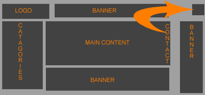 1. This was the old layout. It was very good in our view when we designed it. But over times, our site grew with more and more categories. This made the category list go further and further towards the bottom.
2. The contact button that looked like an envelope was just way too subtle.
3. And the main content that is our bread and butter ended up with very narrow column. The main content area where we list our weekly articles on the home page was less than 458 pixels in width. Did that ever bother us? Never! But what about pages other than the homepage itself? What about one of our programming tutorials with programming example codes that need plenty of room to be properly visible? There we lacked column width. Some codes that should not have a line break ended up on several lines and created an untimely confusion to readers in many instances.
4. Even when we started with our price check service via PriceGrabber, we hadn't a clue where to put it other than the categories area.
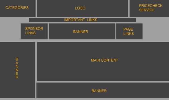 1. Here is the new layout. It is also very good in our view but God knows for how long. In this layout the categories are all put into a drop down box on the far top left corner. Keep in mind that this area is always the fastest loading portion of any website by source code. Not only is it speedy but takes least amount of our valuable space.
2. We eliminated the contact button all together and replaced it with a contact link on the bottom (this link was there in the old layout as well).
3. The main content area TONS more width to run around freely like wild horses.
Ok, maybe too much western isn't good for me anymore! This width allows us to put more odd sized banners in our pages as well. There has always been a demand to get higher quality banners and the total annihilation of pop-ups. And this may just be our chance. Even though, Mr. C at MaxOnline has been trying to help us remove of all our pops, they still come lingering back on somehow. But with more highly responsive banners that don't quite tick off our viewers these transitions become easier.
4. Price Check finally got its own personal area on the upper right corner.
These are just some of the layout transitions we have managed to write about so far. There are many more that will almost be unnoticed.

Speed
What makes a webpage become slow? Two things mostly: Bad HTML and Bad Graphics Technique. We worked hard to improve both. Each page is now made of (to a great extent more) optimized code. Meaning there is no junk HTML left (at least it seems for now); combined with a lot smaller and lesser number of graphic images will create faster downloading of our site.
One thing we noticed that really dropped our speed down was a Random "Did You Know" script that we were using from Hosted.Com. So we have completely done away with that and have developed our own script to do the job.
New Functionalities
- There are several new functionalities added to TechiWareHouse now. The most effort absorbing was the very much requested Message Board. The message board still needs to be properly planned out in matter of content there. Whether to use this topic or that and son on.
- Another function that was lacking was a way for TechiWareHouse to be saved as a homepage. Many, many, and one too many newbies have contacted us to find out how to add TechiWareHouse as a favorite/bookmark and how to make www.techiwarehouse.com their starting homepage. Well now, each page on the site is equipped with an "Add to Favorite" and "Make Your Homepage" links on the right hand side of the top banner.
- We've also always wanted to add a feature for friends, co-workers, family members, etc…to be able to send each other page links from our site. Rather than emailing each other descriptions about some article a person has read on the site; now they can email each other proper links for the correct page they've just visited. This feature is useful to our visitors as well as us to spread the word around.
- And how about a single page list of all the articles and tutorials on the site throughout? Well now we have single page list containing links to all the tutorials on the site.
- Lastly, it is important to point out that these functionalities are what are coming equipped with new changes. That is not to say that further improvements and tweaks won't be made at TechiWareHouse. Those of you who've been visiting us for longer than a year or so already know that we will not rest so easily.
Conclusion
I hope this brief explanation of the new changes helped put some light on what the changes are and more importantly why they were long overdue. Until next week…
Now that you've gotten free know-how on this topic, try to grow your skills even faster with online video training. Then finally, put these skills to the test and make a name for yourself by offering these skills to others by becoming a freelancer. There are literally 2000+ new projects that are posted every single freakin' day, no lie!
 Previous Article |  Next Article |